The first assignment was to write your creative story, which as it turns out, I kind of did yesterday... at least my creative story as far as photography goes. So, check!
Next up was a creative assignment to "keep it simple" - we were given a background texture and told that "less is more". Well, if you know me, less is never more. So. I started getting grumpy. I mean, really. White is not a color! I had just gotten through complaining about the latest "Country Living" magazine that is all about neutrals. The whole issue is WHITE. What fun is that? Give me color, give me texture and I'm happy happy happy. You can only imagine how hard this was going to be for me now, right? Keep it simple, less is more, lighten up. Gah! <-- that's me pulling my hair out!
Sigh. (See, this is what I was afraid of when I signed up for the class... Kim's pictures are all soft and pale and pretty and delicate and romantic and so different from... well, everything *I* make. I was hoping it wasn't going to turn out to be a class learning how to make our photos look like hers... and I'm still pretty sure it's not going to be that... because she has skills! Mad skills.... skills I might learn from and use in my own way, that is actually one of the things that excited me - she doesn't have a style that I'm at all tempted to copy - not that her photos aren't drool-worthy - but they aren't *me*. If I can figure out how to take those skills and do things my way... then.... it will be ok...)
So. I went through my old photo files. I looked at some of the creations I'd made in the past few days and thought, huh, I guess this might be what she means by over-done. I could try again and do less.... I guess. Or, not. I grabbed a few items from around the house and went and shot a few photos in my lightbox (which felt like work and made me even grumpier.) I went back to my old photo files. I moaned and groaned. And finally, I went outside to see what the yard had to offer. That was much better. The bird feeders needed filling, the chickens all came around and chatted at me like they hadn't seen me in days... it wasn't raining... it wasn't white! A lot of brown though. And green. But, not much interesting. I walked around... I snapped a few photos. I came back in and made myself a smoothie... and then I sat down and said, ok, keep it simple, Pam.
And this is what I made. (You can click on the photos to see them enlarged.)
First up, an old photo, a very old photo... a magnolia blossom. Kim's "Awaken" texture, at 50% opacity, overlay.
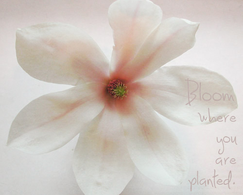
and the original file:
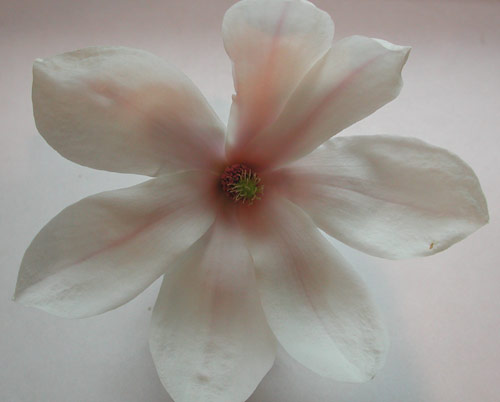
(OK, so that didn't hurt... but it's not very exciting.)
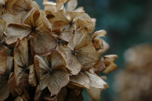
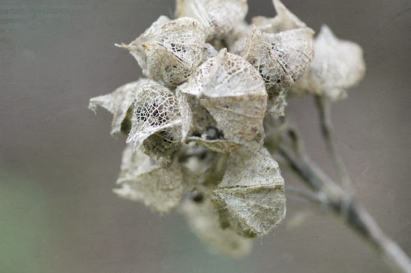
This next photo got an "oh, yeah" from me when I was surveying my memory card haul. So... why not. It's not light or bright, but if you think about it, less is more here... it's still beautiful, even as it fades and decays. Right? My interpretation.
Texture layer at 60% overlay.
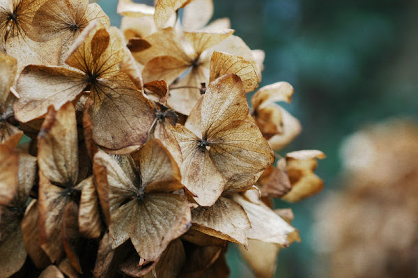
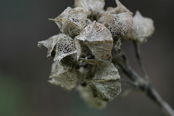
And the original:
So far so good. But in the back of my mind, I kept hearing a little nagging voice (complaining?) that Kim had used her texture file at 100% opacity. How did she do that? My photos kept getting crazy bright and ugly when I tried that. But... I wasn't going to give up... I was going to figure this out. And on this photo, I made it work.
100% Opacity; Soft Light. Yes! To me, this one needs... something more, I don't love the composition, though I do like the subject. And I like what the texture at 100% did for it. So, I'm stopping, because less is more. Maybe. Maybe... sometimes.
and the original:

No comments:
Post a Comment